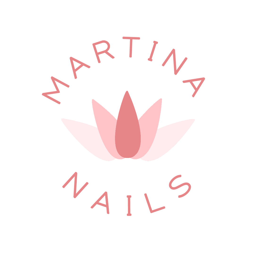
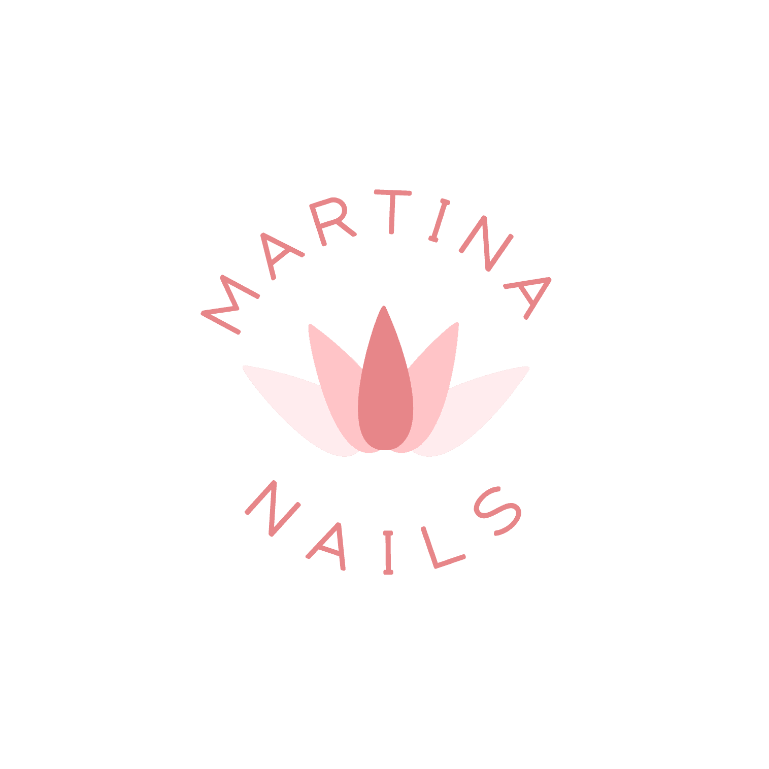
Martina Nails
"Martina Nails" is a logo designed for a small business in the nail art and beauty industry. The goal was to create an elegant, delicate, and professional visual identity that conveys femininity and sophistication.
Details
Logo Designer
Brand Identity Designer
Logo Design
Graphic Design
Industry:
Beauty
Wellness
August 2023
Overview
The logo combines modern typography with a creative visual representation of nails arranged in the shape of a lotus flower. This design choice symbolizes beauty, growth, and transformation—key elements in the nail art and self-care industry. The use of soft pink tones enhances the sense of elegance and femininity, while the circular text arrangement adds a harmonious and balanced touch. The overall design conveys professionalism and refinement, making it ideal for a beauty-focused brand.
Key Features
Nail-Lotus Symbol - The central design creatively arranges nails to form a lotus flower, symbolizing beauty, growth, and transformation.
Curved Typography - The brand name follows a circular layout, enhancing harmony and elegance.
Soft Pink Color Palette - Delicate shades of pink evoke femininity, sophistication, and a sense of care.
Minimalist & Elegant Design - A clean, balanced composition ensures a modern and professional look while maintaining a unique identity.
Mission
The aim of this logo was to create a visual identity that expresses care, beauty, and precision—essential values for a nail art brand. The design is meant to inspire trust and professionalism in clients.
Challenges Faced
Balance Between Minimalism and Detail - The logo needed to be simple yet recognizable without appearing too plain.
Text Legibility - Arranging the brand name in a circular form while keeping it readable.
Color Selection - Finding the perfect shades to convey delicacy without losing visibility.