Improving WakeTrain's Passenger Alert System
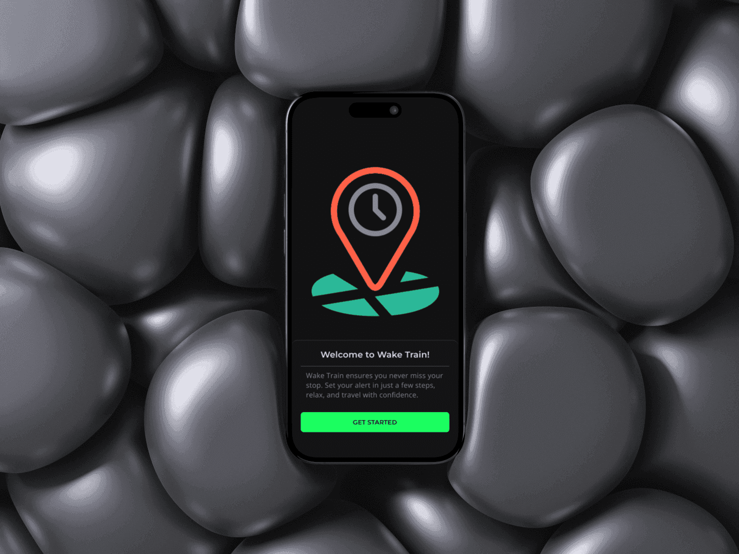
WakeTrain is a UX redesign of a previous project, focused on helping train passengers rest during their journey without the anxiety of missing their stop. The project delivers a simple, intuitive alert experience designed for clarity, reassurance, and ease of use, even in low light travel conditions.
UX | UI Design
Utility | Transport
March - April 2025
Challenge
The main challenge was designing a time sensitive utility experience that users could trust while sleeping or resting.
The interface needed to be quick to set up, visually clear in dark environments and emotionally reassuring, reducing stress rather than adding cognitive load.
Another key challenge was balancing speed and flexibility, ensuring the experience worked equally well for daily commuters and occasional travelers, while meeting accessibility standards.
Results
The redesign delivers a calm, reliable, and user-friendly alert experience that supports confidence and peace of mind during train travel.
Clear alert flows, high contrast visuals and simplified interactions reduce friction and make the app easy to use in real world conditions.
The result is an interface that prioritizes usability, accessibility and emotional comfort in a utility focused context.

Process
User Research
I analyzed common commuter pain points, focusing on anxiety, trust, and ease of interaction in time-critical scenarios.
Wireframing & Prototyping
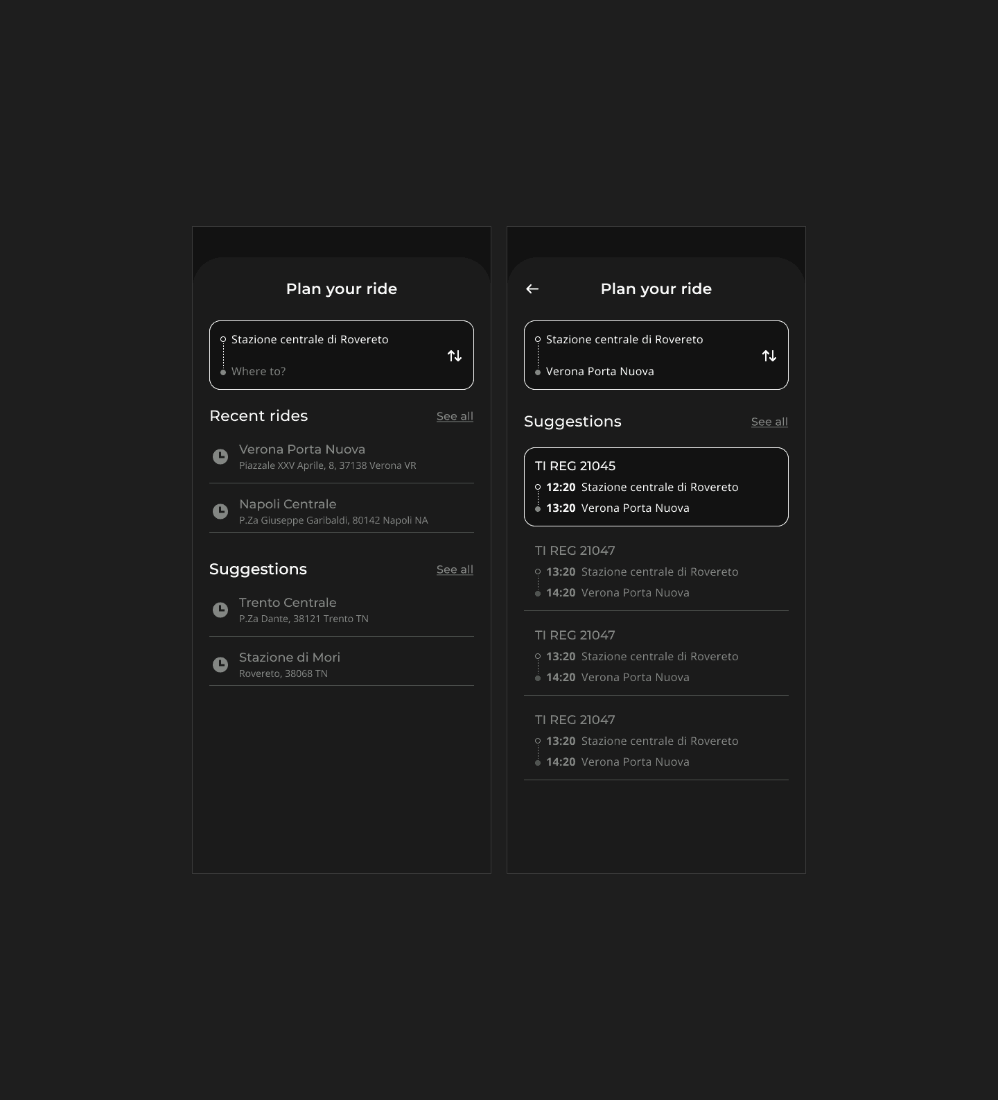
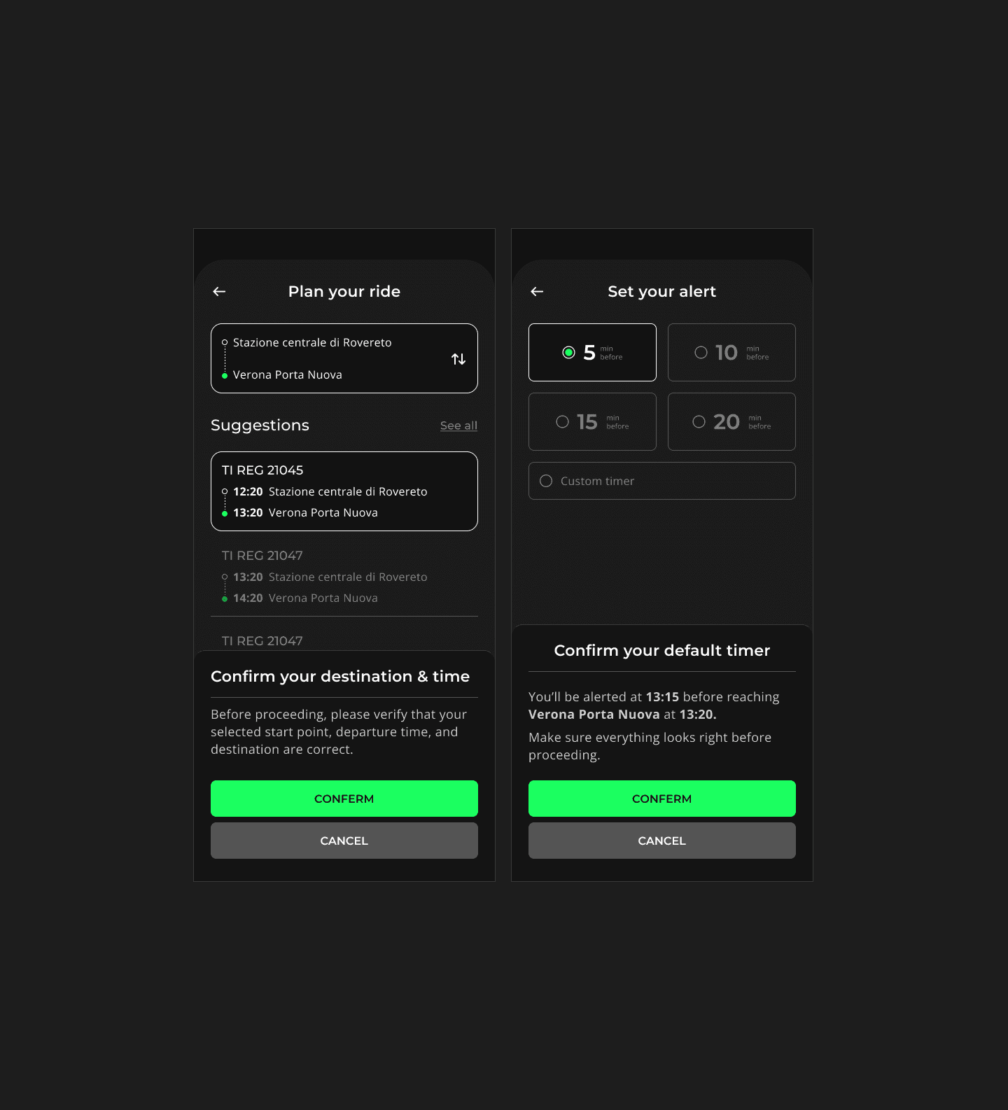
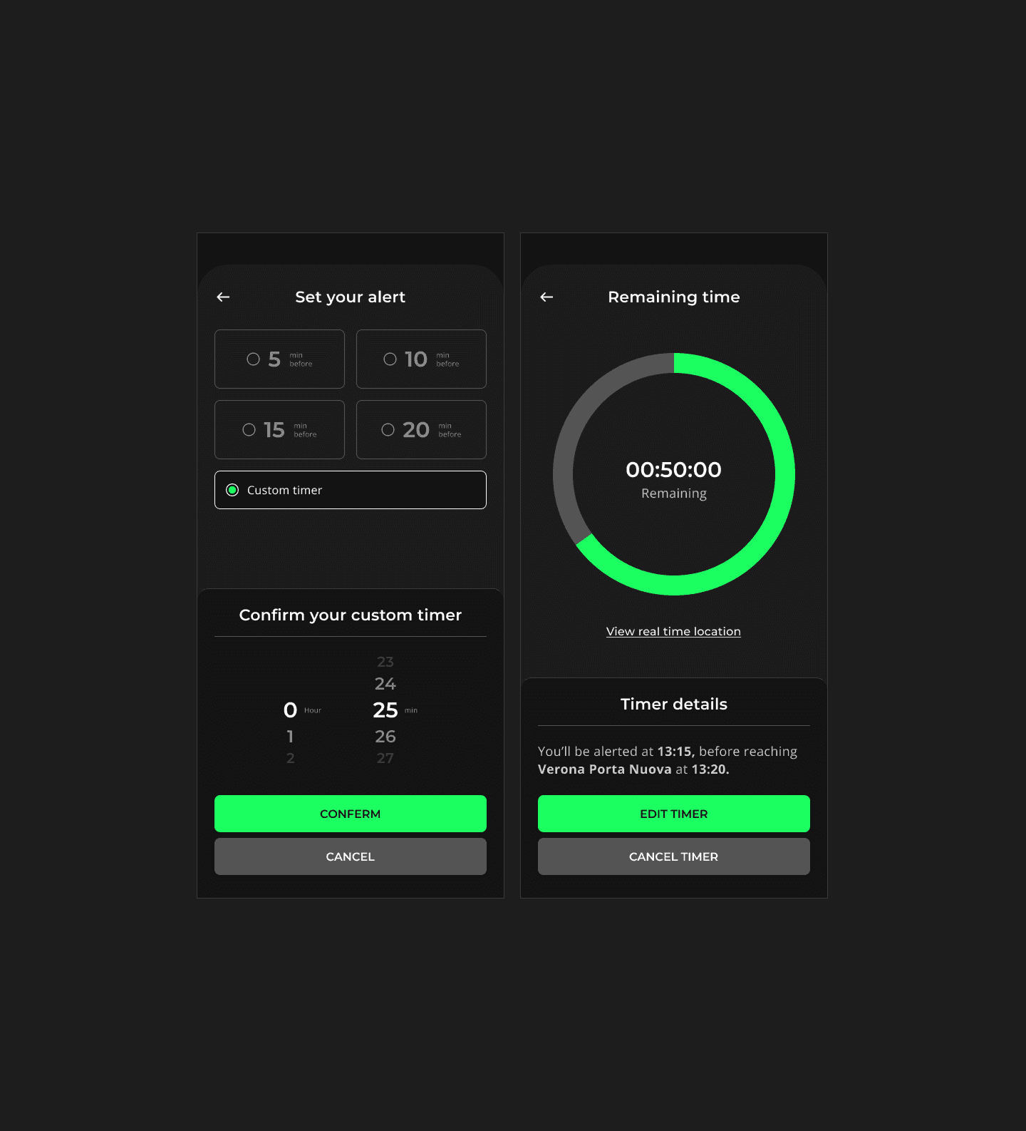
I started with low-fidelity wireframes to define core flows and information hierarchy, then moved to mid-fidelity prototypes to test alert setup and navigation. Finally, I developed high-fidelity prototypes to visualize the final product and conduct end-to-end usability testing on a fully working experience.
UX/UI Design
I refined the experience through high-fidelity prototypes, focusing on clarity, accessibility, and reduced cognitive load.
Iteration
Design decisions were validated and refined based on usability considerations and user feedback.

Visual Design & Style Guide
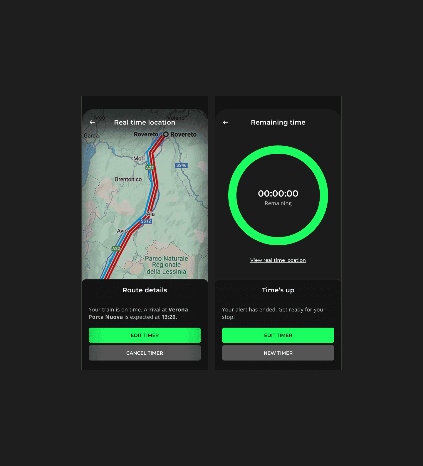
The interface uses a dark mode UI with green accent colors, chosen for their association with safety, calmness, and clarity.
Green provides strong contrast in low-light environments, improving visibility during nighttime or tunnel travel.
The UI follows WCAG accessibility guidelines, with tested color contrast and clear visual hierarchy to support users with mild visual impairments or color blindness.

Conclusion
WakeTrain app's remake demonstrates a user-centered UX approach applied to a real world utility problem.
By focusing on clarity, accessibility and emotional reassurance, the project shows how thoughtful user experience design can reduce anxiety and improve everyday travel experiences.
The redesign highlights my skills in user research, prototyping and design within a time sensitive and high trust context.